Sunday 22 May 2011

I just got this done.

Uploading here because Photobucket doesn't work. I got this done 3 days ago because I like to play games in my personal computer.

Yes, it did hurt.

Thursday 28 April 2011

Progress might be happening.

Or maybe not, because I've reached my max polygon count before my computer automatically shuts down Maya. LOL. Time to move my half-done work to the University servers, I think!

(My most recent version is actually about 10% more finished than this one - but it's on my dekstop PC and that's too much effort to switch on as it's too far from my bed.)

Monday 4 April 2011

I got trees wrong.

Okay, so all along I was doing forest trees slightly wrong.

I was modelling trees so that lower branches were the same size as upper brances, bad move! Remodelling a tree now to test out how these stubby branches look. Already looks slightly more realistic and I'm only 5 minutes in.

Will post more as progress continues~

Monday 28 March 2011

Will write more maybe.

Influence;

(These aren't my images; just images I used in my mood board to inspire me. Will put my own concept images up as soon as they are finished. :3 )

Mushroom-in-Progress;

The start is always so off-putting...
But it begins to take shape... 

I just love these.

I thought I'd make a quick post about one of the main inspirations in my current 3D landscape project. Although my original idea stemmed from pre-raphaelite artists, and Arthur Rackham's fairytale styled work, I find that the forest landscapes pictured on MTG Basic Land cards are both magical and serene, and capture a forest atmosphere perfectly.


Springtime has infected my PC.

I finally finished my first 3D model in Maya. It's not that great, but I'm proud because it's the first one that I haven't given up on halfway through.

I made the bluebell's textures quickly in Photoshop which explains why they're so crappy. I just used low opacity watercolour brushes to create different tones to make the final render a bit more interesting. The flowers are actually just a prop for my final image which I am planning on having very foresty/fairy tale inspired.
As for the model iteself it took a lot of trial and error as I am still learning to use Maya. The lighting I played around with, as I wanted the main light to come from a spotlight - sort of the same way sunlight filters through tree branches in a forest.

Thursday 6 January 2011

Deathbed; Character Persona

The character that is conveyed in "Deathbed" is a drunkard, a smoker, a typical let down who has lost his kids and his wife and has no pride left in himself. To illustrated this as a person, I tried to take effects of lower class living (in the early 1900's) and repeated alcohol abuse.
I came up with this sketch in my sketchbook of what I visualised the character to look like. His eyes are sunken in their sockets and deeply shadowed to suggest lack of sleep and general run-down. The fact that the eyes are wide and that the brow is tilted is to suggest anxiety, as I imagine that repeated drug abuse would make a person very paranoid. I gave him gaunt cheeks with high cheekbones, thin lips and a glazed expression to suggest that he is too busy spending his money on booze to afford to eat properly.

Furthering from this sketch, I redrew the portrait in photoshop. I used airbrushing brushes to paint his face, keeping the tones neutral and cold to suggest a grey palour.
 As well as the portrait, I decided to include a few aspects that I felt were very important to the story. I digitally painted a bottle of scotch whiskey and cigarettes, as the lyrics continue on to detail how the character replaces his personality and self esteem for nicotine and liquor. At the very bottom I painted white lillies which are a well known icon for death and funerals. However, the delicate lillies also act as a contrast with the harsh effects of cigarettes and whiskey.
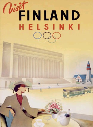
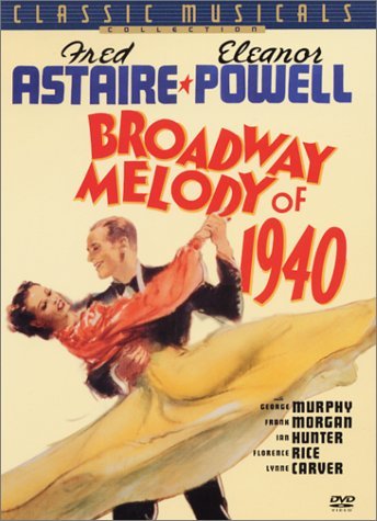
The text at the top of the image is a selection of lyrics, and I aimed to have it in the same sort of style as many 1940's posters as can be seen below;
(Neither of these images are mine; credit goes to www.harveyabramsbooks.com and  maxzook.wordpress.com as artists are unknown.)
The text in both of these posters is a mix of cursive and blocky capitals, so I tried to recreate this when quoting my lyrics.

Wednesday 5 January 2011

Deathbed

For my second coursework assignment we have to develop 2D work associated with a story that has no visuals tied to it already. For mine I chose the song "Deathbed" by Relient K. It's nine minutes long and tells the story of an oldman on his deathbed seeking redemption and reliving his memories as he lies dying.

To create a starting point for myself I created a moodboard of various photos that I associate wth the story. Overall, there is a theme of contrasting happiness and depression. There are elements of typical "good" things in the story such as marriage and giving birth, but they are marred; "the union was far from harmonious". Furthermore, that face that the story is set in the 1940s means that a lot of the photos are black and white. The absence of colour serves to strengthen the bleak tone of the story.

Exploring this scene further I researched some of the 1940's clothing styles and loss of morals in my sketchpad to aid with getting the atmosphere of my two digitally generated pieces correct.
I then moved on to digitally painting one of my first ideas for my scene. I was originally going to have the old man lying on his deathbed, surrounded by the clinical colours of hospitals and experiencing ethereal visualisations of his past wife and kids in the ward room. However, after a while I decided that perhaps the scene would be far too literal and proceded to explore down a different aspect of the lyrics so these two remain unfinished mock-ups.

One of the lines in the song; "The bottle of beam kept the memories at bay" struck up a particulary striking image in my head. Whenever I heard it, I always picture a defeated looking man sat at a grubby dock-side harbour bar with working class clothes and slumped shoulders. I sketched up a quick concept image in my sketchbook before experimenting in photoshop.
And the finished piece...
I wanted the piece to look kind of "rough", quite like how concept art for games is done quickly with dry brush effects and colours that aren't totally blended. I think this kind of effect creats a hazy atmosphere which you would expect in a grimey, harbour side inn of the late 1800's/early 1900's.