Monday, 28 March 2011

Will write more maybe.

Influence;

(These aren't my images; just images I used in my mood board to inspire me. Will put my own concept images up as soon as they are finished. :3 )

Mushroom-in-Progress;

The start is always so off-putting...
But it begins to take shape... 

I just love these.

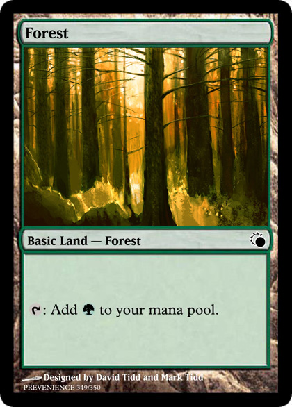
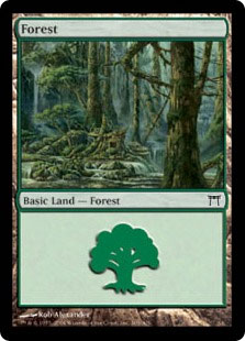
I thought I'd make a quick post about one of the main inspirations in my current 3D landscape project. Although my original idea stemmed from pre-raphaelite artists, and Arthur Rackham's fairytale styled work, I find that the forest landscapes pictured on MTG Basic Land cards are both magical and serene, and capture a forest atmosphere perfectly.


Springtime has infected my PC.

I finally finished my first 3D model in Maya. It's not that great, but I'm proud because it's the first one that I haven't given up on halfway through.

I made the bluebell's textures quickly in Photoshop which explains why they're so crappy. I just used low opacity watercolour brushes to create different tones to make the final render a bit more interesting. The flowers are actually just a prop for my final image which I am planning on having very foresty/fairy tale inspired.
As for the model iteself it took a lot of trial and error as I am still learning to use Maya. The lighting I played around with, as I wanted the main light to come from a spotlight - sort of the same way sunlight filters through tree branches in a forest.

Thursday, 6 January 2011

Deathbed; Character Persona

The character that is conveyed in "Deathbed" is a drunkard, a smoker, a typical let down who has lost his kids and his wife and has no pride left in himself. To illustrated this as a person, I tried to take effects of lower class living (in the early 1900's) and repeated alcohol abuse.
I came up with this sketch in my sketchbook of what I visualised the character to look like. His eyes are sunken in their sockets and deeply shadowed to suggest lack of sleep and general run-down. The fact that the eyes are wide and that the brow is tilted is to suggest anxiety, as I imagine that repeated drug abuse would make a person very paranoid. I gave him gaunt cheeks with high cheekbones, thin lips and a glazed expression to suggest that he is too busy spending his money on booze to afford to eat properly.

Furthering from this sketch, I redrew the portrait in photoshop. I used airbrushing brushes to paint his face, keeping the tones neutral and cold to suggest a grey palour.
 As well as the portrait, I decided to include a few aspects that I felt were very important to the story. I digitally painted a bottle of scotch whiskey and cigarettes, as the lyrics continue on to detail how the character replaces his personality and self esteem for nicotine and liquor. At the very bottom I painted white lillies which are a well known icon for death and funerals. However, the delicate lillies also act as a contrast with the harsh effects of cigarettes and whiskey.
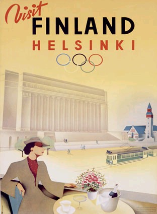
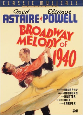
The text at the top of the image is a selection of lyrics, and I aimed to have it in the same sort of style as many 1940's posters as can be seen below;
(Neither of these images are mine; credit goes to www.harveyabramsbooks.com and  maxzook.wordpress.com as artists are unknown.)
The text in both of these posters is a mix of cursive and blocky capitals, so I tried to recreate this when quoting my lyrics.

Wednesday, 5 January 2011

Deathbed

For my second coursework assignment we have to develop 2D work associated with a story that has no visuals tied to it already. For mine I chose the song "Deathbed" by Relient K. It's nine minutes long and tells the story of an oldman on his deathbed seeking redemption and reliving his memories as he lies dying.

To create a starting point for myself I created a moodboard of various photos that I associate wth the story. Overall, there is a theme of contrasting happiness and depression. There are elements of typical "good" things in the story such as marriage and giving birth, but they are marred; "the union was far from harmonious". Furthermore, that face that the story is set in the 1940s means that a lot of the photos are black and white. The absence of colour serves to strengthen the bleak tone of the story.

Exploring this scene further I researched some of the 1940's clothing styles and loss of morals in my sketchpad to aid with getting the atmosphere of my two digitally generated pieces correct.
I then moved on to digitally painting one of my first ideas for my scene. I was originally going to have the old man lying on his deathbed, surrounded by the clinical colours of hospitals and experiencing ethereal visualisations of his past wife and kids in the ward room. However, after a while I decided that perhaps the scene would be far too literal and proceded to explore down a different aspect of the lyrics so these two remain unfinished mock-ups.

One of the lines in the song; "The bottle of beam kept the memories at bay" struck up a particulary striking image in my head. Whenever I heard it, I always picture a defeated looking man sat at a grubby dock-side harbour bar with working class clothes and slumped shoulders. I sketched up a quick concept image in my sketchbook before experimenting in photoshop.
And the finished piece...
I wanted the piece to look kind of "rough", quite like how concept art for games is done quickly with dry brush effects and colours that aren't totally blended. I think this kind of effect creats a hazy atmosphere which you would expect in a grimey, harbour side inn of the late 1800's/early 1900's.

Wednesday, 8 December 2010

A shrinking world.

I can't remember where I found this image, but I did not make it and it does not belong to me. ;D
Communication is a wonderful thing and in terms of digital artwork, it can be portrayed in many ways. In my sketchpad I explored a few selections of how I could illustrate communication in my final piece.
One of my first mock ups in Photoshop were two postcards, as postcards are a form of long-distance communcation that is slowly dying out with the introduction of the internet.

Both of these images I took myself on holidays earlier in the year. I played around with colour levels and contrast as well as adding different overlays to create different effects.

HOWEVER...

The first thing that jumps in to my head when I think of "communication" is, admittedly, cyberspace. As we've moved slowly in to a digital era are lives are almost totally entwined with the internet. We shop on it, bank on it, socialise on it, make phone calls on it. We now have internet access in pubs and on our mobile phones. Photoshop can actually be very good at making some neat cyberspace effects, with simple tools like skewing that can create the cliché "parallell plane" type of image. I looked at a few existing images of cyberspace to research what type of effects would succeed in getting my piece to look "electronic".


 None of the above images were made by me, and all we found on google image so credit is to go were it is due. However, they served the purpose in showing me what type of layers make up a typical interpretation of cyberspace; wire frames, circuits, glowing lights, binary and pixels.

Expanding from a quick doodle in my sketchpad of a binary earth; (binary being the primary language for computer circuits) I whipped up a graphical image that expresses pretty much how I see cyberspace.

There is quite  a lot of effects going on in this image. My very first starting point was to create a layer of binary over a world map where the continents and landmasses were replaced with 1's and the water with 0's. Once it was complete, I selected a section and spherized it a few times, adding shadows as I went, to create a realistic sphere that is meant to represent a planet. 
The background is made up of several layers, the first being a painted world map which I painted myself using very saturated blues and greens. I also used the "Extrude" tool to create square blocks of different depths to represent pixels that make up visual displays on computers. As well as this, I included circuits which I texturised, pixellated and faceted white areas and a layer made up entirely of LCD pixels.

Monday, 4 October 2010

A place of great disorder and confusion.

Visual Literacy; Week 3

Chaos... Could pretty much define my entire university life right now. But hey, that's what independance is about, right? From the state of my room to the state of my artistic thought processes, pretty much every part of my life has full potential to be chaotic. It's an interesting word to demonstrate as it is entirely dependant on perception. What I might think is an organised mess might be another person's nightmare.


The opening of Primark in Oxford street, London, is one of the most chaotic things I have seen on the internet. Several people were injured - all for the sake of cheap clothes.


A photograph I took outside my university halls. It's a police barrier that is put up every night to prevent drunken crowds that pour outside of the nightclubs getting in to the apartments. When I see them stashed away the next morning it reminds me of the chaotic groups of drunken people I hear shouting and singing outside my window.
Expanding from the idea of riots and anarchy being symbols of chaos, I decided to play around in photoshop to achieve different flame effects. They could be useful in my final piece for chaos if I decide to create an image orientated around riots as molotov cocktails are particuarly iconic for such disorderly events.

Simply using this tutorial, and making use of the smudge tool and linear gradient tool in photoshop I was able to create a quick and simple flame effect:


A students' room is very chaotic, because we're lazy and quite often hungover. (Disclaimer; this is totally not my room, but I did help to mess it up.)


I wanted to play around with the photo of my flatmate's room but I wasn't sure what sort of theme to aim for. I thought... What art style would I consider "chaotic". Fractal was out of the question, I don't see how I could apply that to the photo; but then I thought... doodles! Doodles by their very nature are chaotic. They're formless and often done when we're absent mindledly laying pen to paper.
Expanding from that, I decided to play around with the photograph in photoshop by drawing over it with the paint tool. I came up with a rather nice result.
Adding different effect filters gave my image different results. I included layer maskers and solarized the palette to add a gloomier mood to the overall image.


/needsfinishing/